Foundations
Typography
Three typefaces with fixed roles, and the rules for setting headlines that feel confident, compact and unmistakably Xe.
Typefaces
Three typefaces, each with a fixed role.
They are not interchangeable. IBM Plex Sans carries headlines and numbers, IBM Plex Serif emphasises key words within headlines, and Zalando Sans is the workhorse for marketing body copy and all product text.
Headline specs
The headline recipe.
Headlines do the heavy lifting, so they're built to a fixed recipe: IBM Plex Sans Regular, sentence case, -5% letter spacing and 95% line height, with IBM Plex Serif Light Italic reserved for the odd highlighted word. Compact and assertive, never cramped.
- IBM Plex Sans Thin
- IBM Plex Sans ExtraLight
- IBM Plex Sans Light
- IBM Plex Sans Regular
- IBM Plex Sans Medium
- IBM Plex Sans Semi Bold
- IBM Plex Sans Bold
Headline don'ts
Where headlines go wrong.
The same headline, set four ways it shouldn't be. Loose or tight line spacing, all caps, and off-brand weights all pull it away from the recipe.
Xe is the cross-border FX expert since 1993
Xe is the cross-border FX expert since 1993
Xe is the cross-border FX expert since 1993
Xe is the cross-border FX expert since 1993
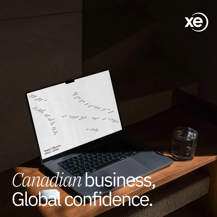
Type on photography
Legibility comes first.
Type can sit on photography, but legibility comes first. Place headlines only where the image gives clear space and strong contrast. If the background is busy or the contrast is weak, don't force it: crop differently, add a quiet area, or take the type off the image.